
New Wave typography
New Wave typography
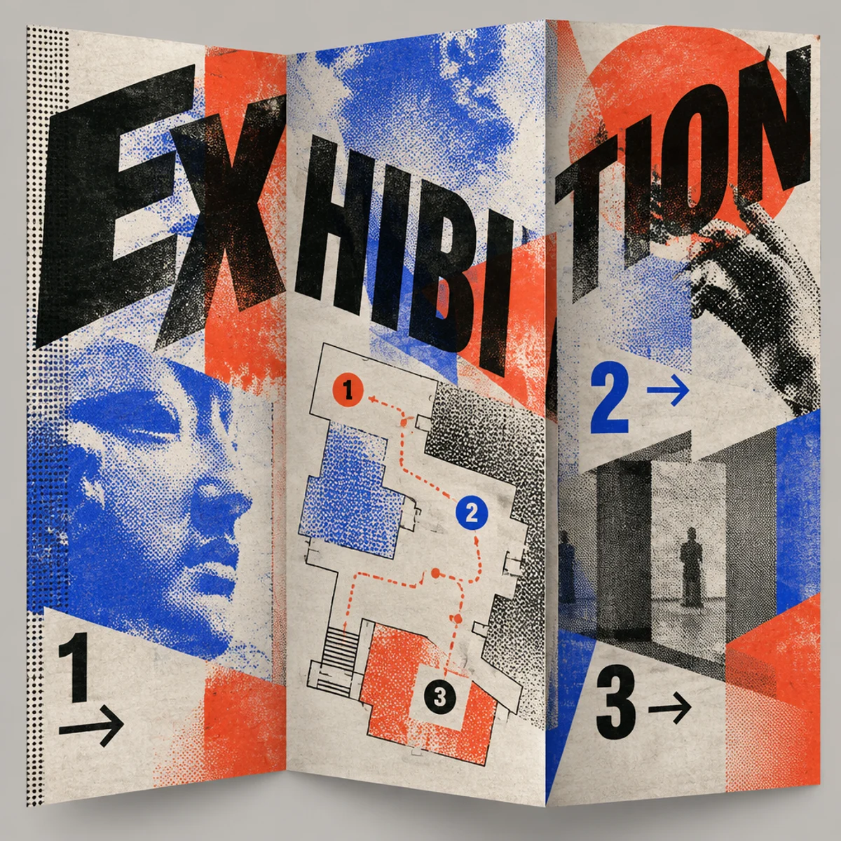
A tri-panel fold-out typographic map with tilted annotations, halftone overlays, and fractured hierarchy, extending New Wave into navigational print.
Make
New Wave typography treatment with disrupted typographic grids, layered halftone textures, unstable spatial hierarchy, and fold-out tri-panel wayfinding composition.
This keeps Weingart-derived New Wave traits—looser grid, overlapping layers, painterly/halftone surfaces—but shifts them into a fold-out wayfinding object. The visible difference is sequential navigation across seams instead of a single poster field, creating a more spatial, map-like reading experience.
A starting point: add your own subject or details in your image tool.
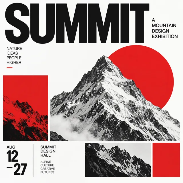
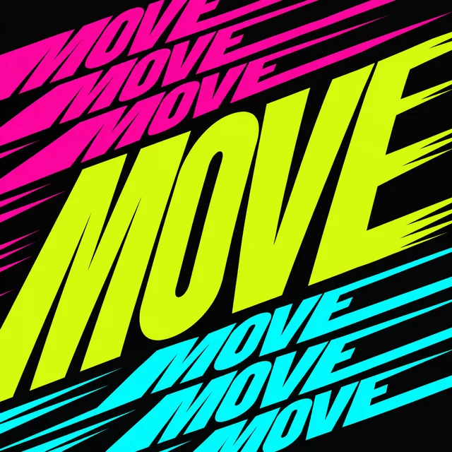
Another original example of the same style seed.
Automated review only; results vary by image tool.
Compare more directions
Explore other approaches for this kind of project.

Look closer: traits and nearby styles →
About this example
This image may have used extra directions. The seed above is a reusable starting point and may produce a different result.
- Created with
- OpenAI Image API
- Model
- gpt-image-2.5-flare
- Generated
- 2026-10-14
Original variation selected from research plan variation-new-wave-typography-exploration-1. Independent automated style and image review: The first image clearly retains New Wave typography: disrupted grid, diagonal type, layered halftone textures, unstable hierarchy, and collage-like mark-making. It also realizes the requested niche variation as a fold-out exhibition map: a tri-panel unfolding composition with a dense central map/type field, flanking tilted annotation bands, seam-crossing labels and arrows, and halftone navigation ghosts that convert the poster language into a navigational sequence. Compared with the existing sample and the sibling images, the visible result is not a generic subject swap or recolor; the composition changes from a poster-like headline image to a three-panel wayfinding map with distinct spatial reading and panel-seam interaction. Exact/perceptual checks passed. 1024px source enlarged to 1200px WebP; no human visual review.
How to use this promptRead as Markdown
Look closer at New Wave typography
New Wave typography loosens the grid with diagonal type, layered image-text collisions, and mixed mechanical textures for a restless postmodern page.
In the original generated example: An abstract poster with tilted type, layered textures, and a disrupted grid. Notice which details catch your eye before deciding whether the whole style is for you.
Explore across projects: Letters with personality
Ask yourself: is it the palette, the surface, the shapes, or the subject you like? Save a favorite and use the visual taste guide to find a useful next direction.