
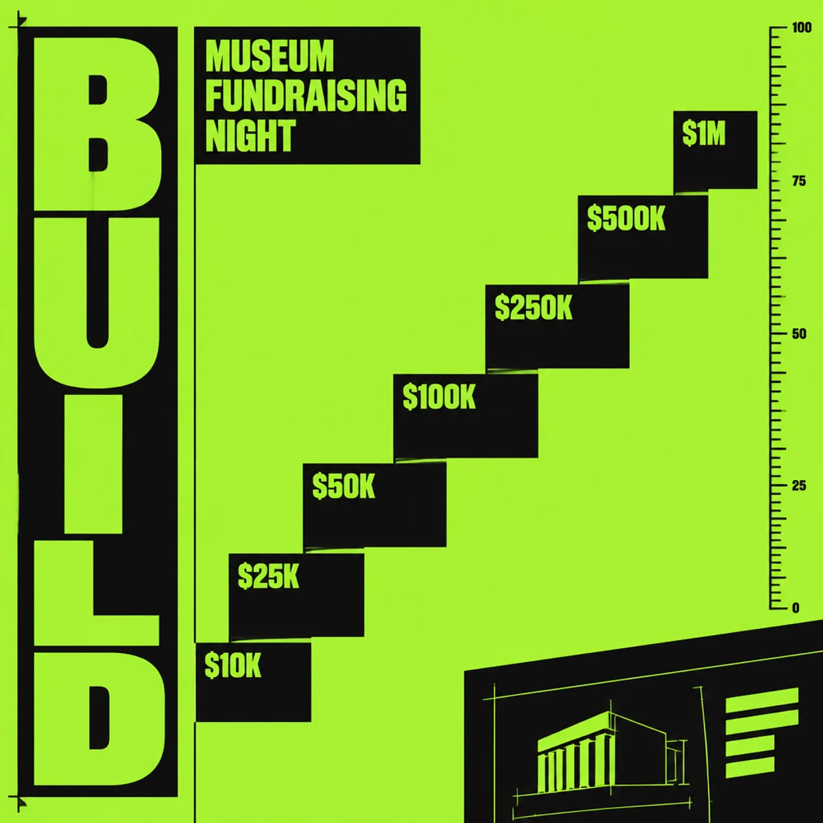
Neo-brutalist poster
Neo-brutalist poster
A museum fundraising poster in neo-brutalist language, with a left-stacked typographic spine, diagonal tier ladder, and sparse blueprint spacing.
Make
Neo-brutalist poster for a museum fundraiser, left-stacked utilitarian type, diagonal donation ladder, exposed ruler marks, blunt blocks, lime-black contrast.
Keeps the parent style’s heavy utilitarian type, exposed alignment, blunt blocks, and lime-black contrast, but shifts the composition from a generic poster into a fundraising system poster. The diagonal ladder and instruction-sheet crop create a visible spatial change beyond a simple subject swap.
A starting point: add your own subject or details in your image tool.
Another original example of the same style seed.
Automated review only; results vary by image tool.
About this aesthetic and its examples
Compare more directions
Explore other approaches for this kind of project.

Look closer: traits and nearby styles →
About this example
This image may have used extra directions. The seed above is a reusable starting point and may produce a different result.
- Created with
- OpenAI Image API
- Model
- gpt-image-2.5-flare
- Generated
- 2026-10-14
Original variation selected from research plan variation-neo-brutalist-poster-exploration-1. Independent automated style and image review: The first image clearly retains the neo-brutalist poster language: lime-black contrast, oversized utilitarian type, exposed measurement/ruler marks, blunt rectangular blocks, and rigid alignment. It is also a meaningful variation rather than a near-copy because it shifts the subject into a museum fundraising night with a distinct composition: a left-edge vertical BUILD spine, a diagonal stair-stepped donation ladder ($10K to $1M), and a broad asymmetrical negative field that reads like an instruction sheet or blueprint. The result is visibly different from the RAW festival sample and satisfies the niche museum-fundraising application with a specific technical reading path and donor-tier treatment. No unintended defects or watermark issues are apparent. Exact/perceptual checks passed. 1024px source enlarged to 1200px WebP; no human visual review.
How to use this promptRead as Markdown
What makes this a brutalist poster?
Oversized utilitarian type, blunt rectangular blocks and exposed alignment make the graphic structure immediately visible. Abrupt shifts in scale and strong contrast create a deliberately direct, sometimes confrontational hierarchy.
The first example is an event poster. The variation organizes a fictional fundraising message as a stepped typographic composition. Compare how blocks, spacing and type scale carry the message; a different subject or brighter color alone would not demonstrate another direction.
This is a graphic interpretation, separate from Brutalist architecture. The generated lettering and figures are part of a fictional example: proofread and verify any information before adapting an image for a real event.
Look closer at Neo-brutalist poster
Raw type, blunt boxes, and abrupt scale shifts create a deliberately confrontational layout.
In the original generated example: Oversized RAW lettering and blunt black boxes on a lime-green poster. Notice which details catch your eye before deciding whether the whole style is for you.
Explore across projects: Letters with personality
Ask yourself: is it the palette, the surface, the shapes, or the subject you like? Save a favorite and use the visual taste guide to find a useful next direction.