
Material 3 Expressive
Transit information display
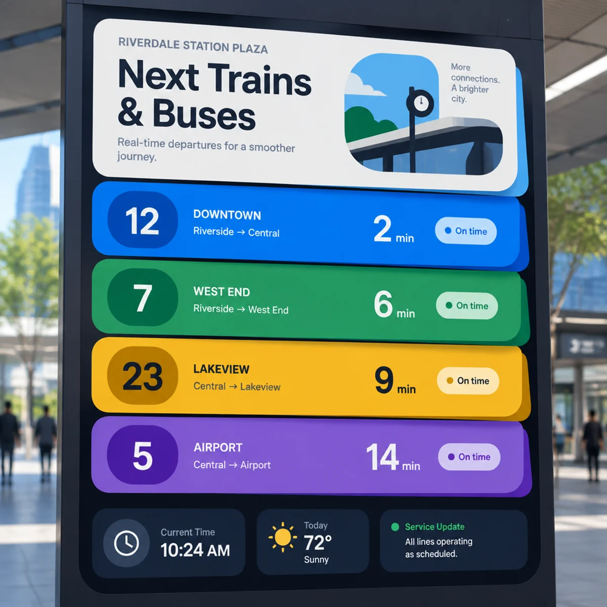
Expressive station-dashboard layout with layered status cards, color-led grouping, and a sharp typographic ladder for live operational content.
Make
Material 3 Expressive transit dashboard with stacked offset cards, color-led status bands, and a commanding typographic hierarchy.
This keeps the recognizable Material 3 Expressive language—vibrant color, contrasting shapes, and clear hierarchy—while reworking the composition into a vertically layered operational board. The difference is visible in the staggered card stack, route-like status grouping, and editorial sequencing rather than a standard app grid.
A starting point: add your own subject or details in your image tool.
Another original example of the same style seed.
Automated review only; results vary by image tool.
About this aesthetic and its examples
Compare more directions
Explore other approaches for this kind of project.
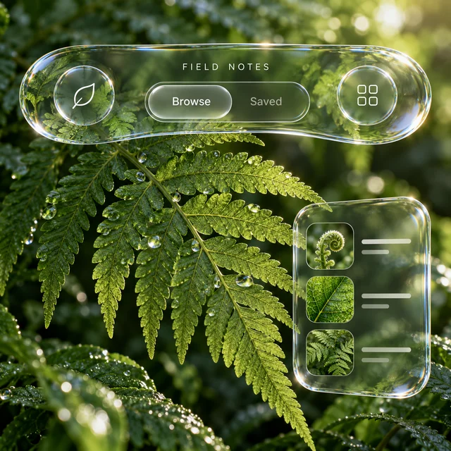
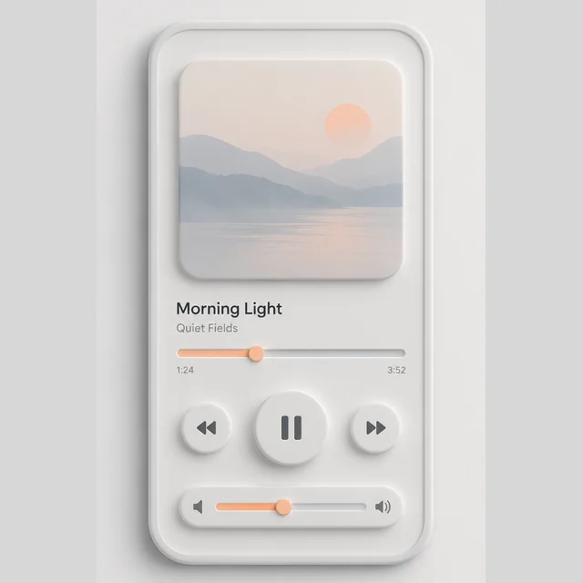
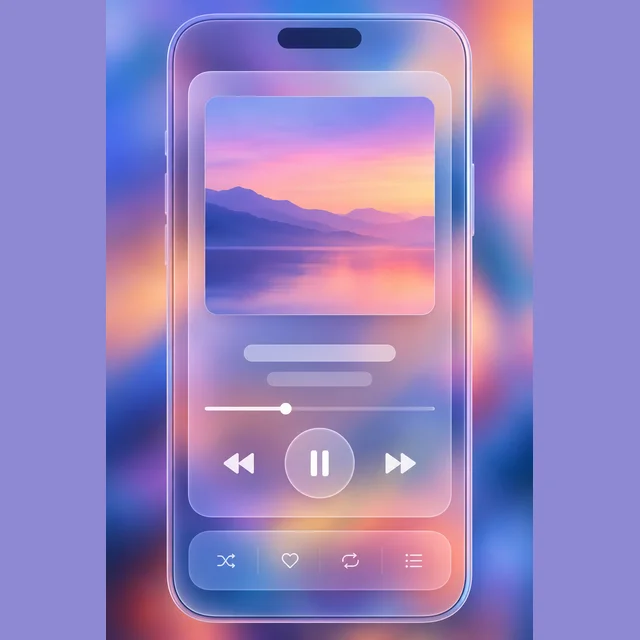
Look closer: traits and nearby styles →
About this example
This image may have used extra directions. The seed above is a reusable starting point and may produce a different result.
- Created with
- OpenAI Image API
- Model
- gpt-image-2.5-flare
- Generated
- 2026-10-18
Original variation selected from research plan variation-material-3-expressive-exploration-1. Independent automated style and image review: The image visibly retains Material 3 Expressive traits: bold contained shapes, saturated color-led grouping, layered cards with rounded/clipped geometry, and strong typographic hierarchy. It is also a clear niche variation rather than a generic swap: the subject is an editorial transit-status dashboard for a station plaza monitor, with stacked offset panels, a dominant route-style headline, compact secondary labels, and distinct route/status color bands. Compared with the listed sample, the composition is meaningfully different in subject and structure: it shifts from a generic app screen to a public-facing operational board with layered vertical bands and discrete status modules, while preserving the expressive M3 language. The result shows nicheNovelty through the distinct station-plaza monitor treatment, visible tiered cards, oversized route/title hierarchy, and magazine-like separation of foreground and background elements. Exact/perceptual checks passed. 1024px source enlarged to 1200px WebP; no human visual review.
How to use this promptRead as Markdown
Shape and color organize the screen
Contained shapes, color groups and changes in type size make the information hierarchy visible. Compare the app concept with the transit display: the same approach organizes different kinds of content at different reading distances.
In the transit example, compare the largest headline, the grouped status panels and the smaller labels. Ask which information reads first and whether the secondary groups remain distinct. A still image can help explore that hierarchy; it cannot establish real viewing-distance legibility, responsive behavior, accessible contrast or live arrival data.
These are fictional interface concepts rather than working apps or evidence of compliance with a platform design system. Compare the contained shape language with Liquid glass, where refraction and translucent layers become more prominent.
Look closer at Material 3 Expressive
Expressive UI with bold contained shapes, color-led grouping, and a strong typographic hierarchy.
In the original generated example: A fictional app screen using bold contained shapes, grouped color blocks, and expressive type hierarchy. Notice which details catch your eye before deciding whether the whole style is for you.
Ask yourself: is it the palette, the surface, the shapes, or the subject you like? Save a favorite and use the visual taste guide to find a useful next direction.