
Material 3 Expressive
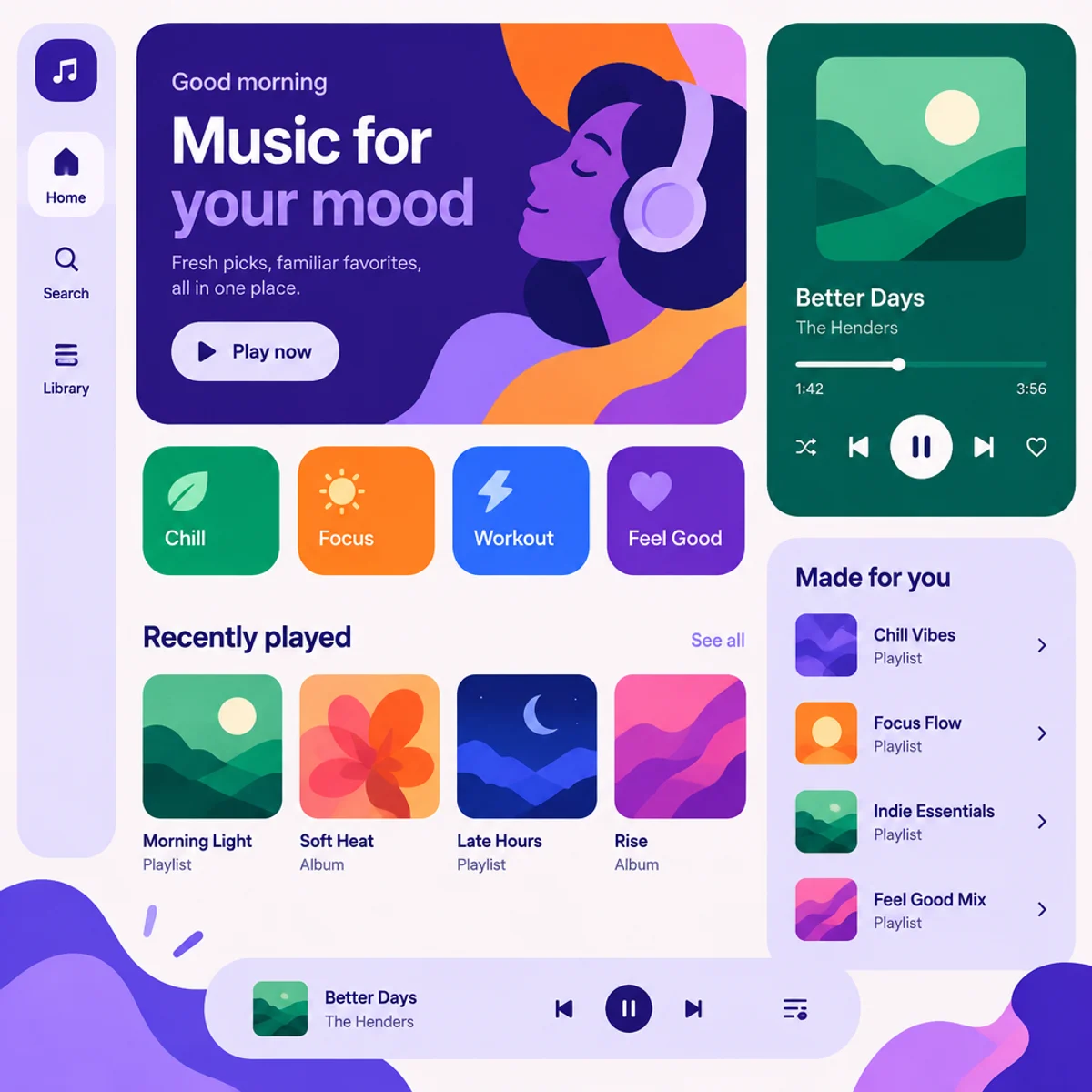
Expressive UI with bold contained shapes, color-led grouping, and a strong typographic hierarchy.
Make
Material 3 Expressive treatment with bold contained shapes, color-led grouping, and a strong typographic hierarchy.
A starting point: add your own subject or details in your image tool.
An original generated example of this visual direction.
A fictional interface concept. Controls, responsive behavior, live data and accessibility have not been implemented or tested; appearance alone does not establish platform compliance.
About this aesthetic and its examples
Compare more directions
Explore other approaches for this kind of project.
Look closer: traits and nearby styles →
About this example
This image may have used extra directions. The seed above is a reusable starting point and may produce a different result.
- Created with
- OpenAI Image API
- Model
- gpt-image-2.5-flare
- Generated
- 2026-10-15
Original OpenAI API image selected from research plan material-3-expressive. Automated independent style review and visual review: Matches Material 3 Expressive: bold contained shapes, clear color-grouped sections, and strong typographic hierarchy in a coherent square fictional music app; no visible watermark or copied brand, and it is not a near-copy of the comparison samples. Exact and conservative perceptual duplicate checks passed against existing samples and this batch. Exported to 1200px and 640px WebP; source 1024px enlarged for full display. No human visual review.
How to use this promptRead as Markdown
Shape and color organize the screen
Contained shapes, color groups and changes in type size make the information hierarchy visible. Compare the app concept with the transit display: the same approach organizes different kinds of content at different reading distances.
In the transit example, compare the largest headline, the grouped status panels and the smaller labels. Ask which information reads first and whether the secondary groups remain distinct. A still image can help explore that hierarchy; it cannot establish real viewing-distance legibility, responsive behavior, accessible contrast or live arrival data.
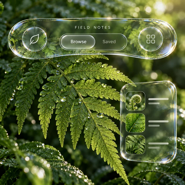
These are fictional interface concepts rather than working apps or evidence of compliance with a platform design system. Compare the contained shape language with Liquid glass, where refraction and translucent layers become more prominent.
Look closer at Material 3 Expressive
Expressive UI with bold contained shapes, color-led grouping, and a strong typographic hierarchy.
In the original generated example: A fictional app screen using bold contained shapes, grouped color blocks, and expressive type hierarchy. Notice which details catch your eye before deciding whether the whole style is for you.
Ask yourself: is it the palette, the surface, the shapes, or the subject you like? Save a favorite and use the visual taste guide to find a useful next direction.