
Vintage travel postcard
Coastal ferry-route terminal postcard
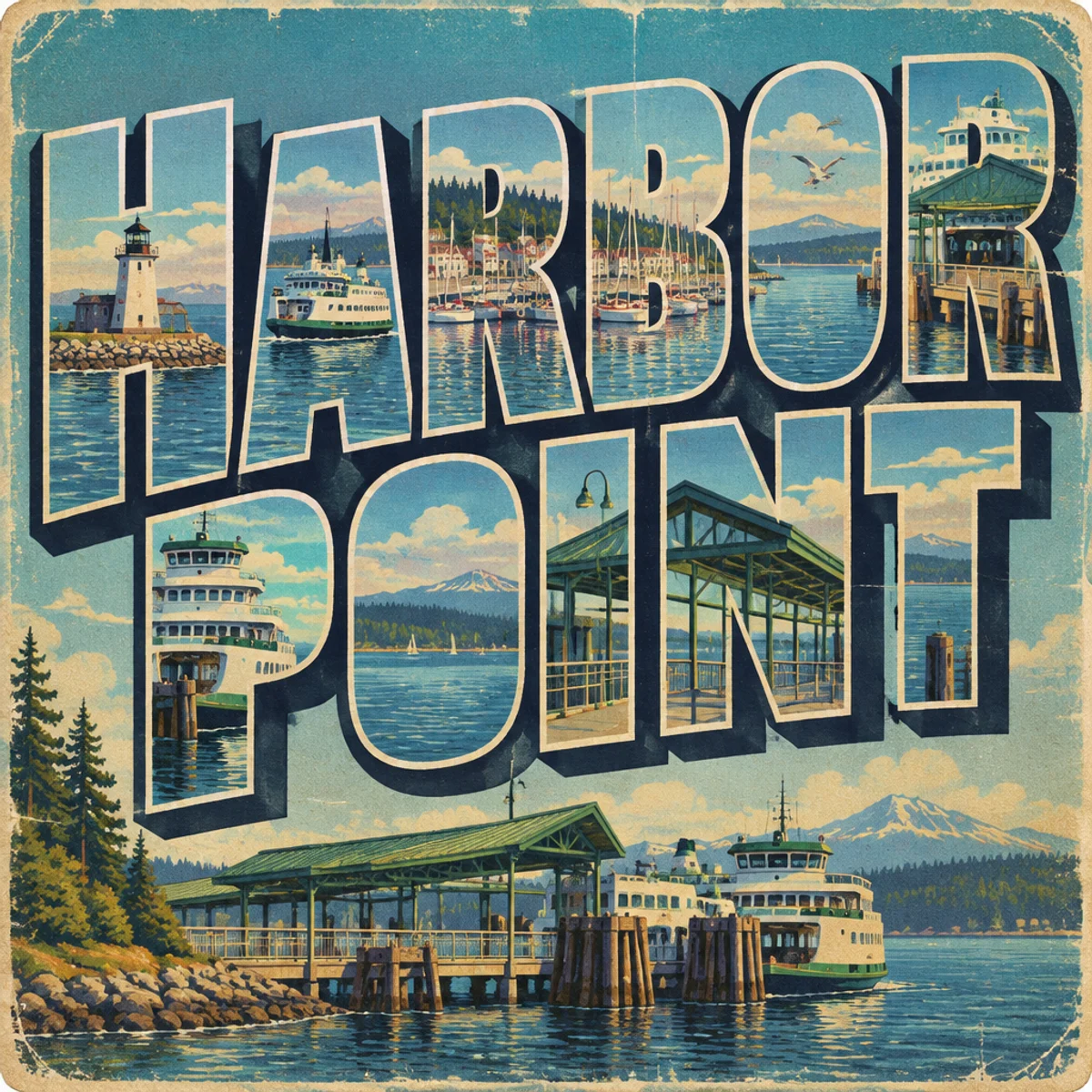
A vintage travel postcard variant focused on a ferry terminal or route hub, using layered harbor views embedded in oversized destination lettering.
Make
Vintage travel postcard of a ferry-route terminal, layered harbor views embedded in oversized destination lettering, bold illustrated scenery, lightly weathered print texture, matte lithographic look.
This keeps the classic postcard language but shifts the composition from a single scenic vista to a transport-hub souvenir. The oversized lettering becomes the structure, while inset harbor layers and terminal geometry make it visibly different from a standard landscape card.
A starting point: add your own subject or details in your image tool.
Another original example of the same style seed.
Automated review only; results vary by image tool.
About this aesthetic and its examples
Compare more directions
Explore other approaches for this kind of project.



Look closer: traits and nearby styles →
About this example
This image may have used extra directions. The seed above is a reusable starting point and may produce a different result.
- Created with
- OpenAI Image API
- Model
- gpt-image-2.5-flare
- Generated
- 2026-10-15
Original variation selected from research plan variation-vintage-travel-postcard-exploration-1. Independent automated style and image review: The image clearly keeps the vintage travel postcard language: oversized decorative destination lettering, layered illustrated harbor/ferry-terminal scenes embedded within and around the letters, and aged lithographic wear with softened edges and print speckling. It is meaningfully different from the lake postcard sample by shifting the niche subject to a ferry-terminal harbor destination and using stacked infrastructure-heavy waterfront vignettes rather than a generic scenic lake view. The composition visibly realizes the intended split-scene postcard layout and transport-infrastructure focus, so the niche application is distinct rather than a simple subject swap. Exact/perceptual checks passed. 1024px source enlarged to 1200px WebP; no human visual review.
How to use this promptRead as Markdown
Lettering becomes part of the scenery
Decorative destination lettering, simplified illustrated views and lightly weathered print texture give the postcard its character. The ferry-terminal variation places harbor imagery within oversized letters, changing how scenery and type share the space.
LAKE WILLOW and HARBOR POINT are fictional destinations. Use your own place name and check each letter before preparing a postcard for print.
Look closer at Vintage travel postcard
Bold illustrated scenery, lightly weathered printing texture, and prominent decorative destination lettering define this vintage travel postcard design.
In the original generated example: A fictional lakeside destination postcard reading LAKE WILLOW, rendered as vintage travel postcard design. Notice which details catch your eye before deciding whether the whole style is for you.
Explore across projects: A little time travel
Ask yourself: is it the palette, the surface, the shapes, or the subject you like? Save a favorite and use the visual taste guide to find a useful next direction.