
Ornamental calligraphy
Ornamental calligraphy
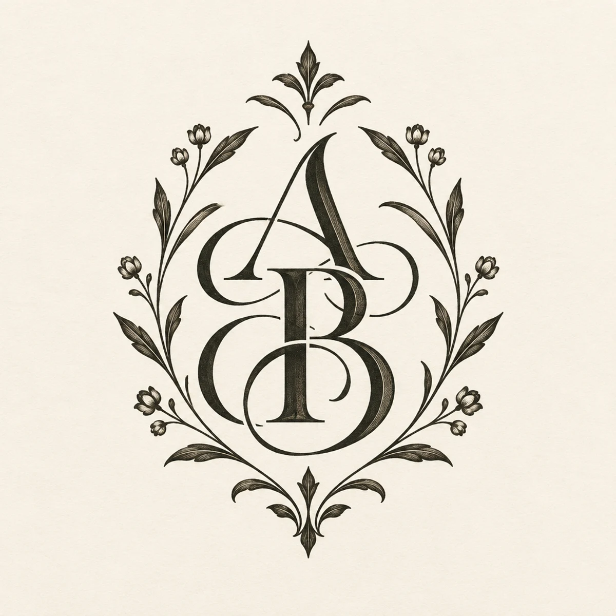
Ornamental calligraphy adapted into a luxury monogram layout for foil-stamped packaging, emphasizing nested counters, crest-like symmetry, and refined botanical framing on ivory stock.
Make
Ornamental calligraphy monogram in a centered crest layout, nested counters, elegant connected forms, restrained botanical framing, pointed-pen thick/thin contrast, ivory stock
This keeps the parent’s pointed-pen contrast, connected forms, and botanical ornament, but shifts from a horizontal word sample to a tight seal-like monogram for packaging. The visible change is structural: stacked initials, denser counterspace, and emblematic symmetry rather than a simple calligraphic line.
A starting point: add your own subject or details in your image tool.
Another original example of the same style seed.
Automated review only; results vary by image tool.
About this aesthetic and its examples
Compare more directions
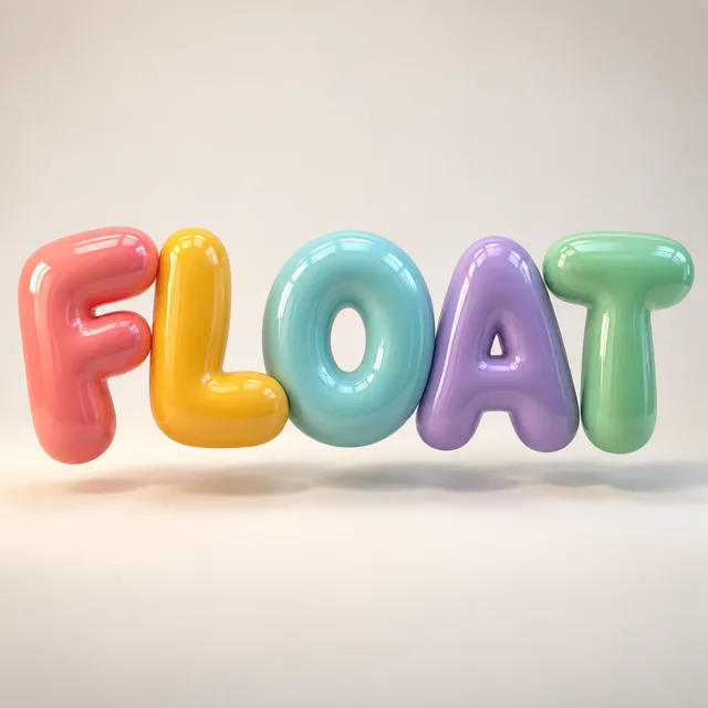
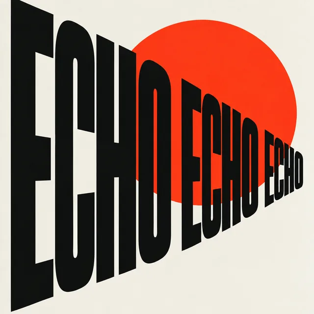
Explore other approaches for this kind of project.

Look closer: traits and nearby styles →
About this example
This image may have used extra directions. The seed above is a reusable starting point and may produce a different result.
- Created with
- OpenAI Image API
- Model
- gpt-image-2.5-flare
- Generated
- 2026-10-17
Original variation selected from research plan variation-ornamental-calligraphy-exploration-1. Independent automated style and image review: The image keeps the ornamental calligraphy language: pointed-pen thick/thin contrast, connected letterforms, ivory paper, and balanced botanical flourishes. It is also visibly transformed into the requested niche application: a centered seal-like monogram for premium packaging, with stacked initials A and B, overlapping structure, nested counters, and symmetrical floral framing that reads as a crest rather than a floating wordmark. Compared with the sibling examples, it is not a word logo like Bloom, not a geometric plotter composition, and not a fashion sketch; this is a distinct subject/composition/result while staying in style. Exact/perceptual checks passed. 1024px source enlarged to 1200px WebP; no human visual review.
How to use this promptRead as Markdown
Flourishes that support the letters
Thick strokes, fine hairlines and connected forms make the lettering rhythm visible. Botanical flourishes work around the word or initials, with open counters and enough space to preserve legibility.
Compare the word Bloom with the A & B monogram. The monogram concentrates the composition around interlocking initials; it does not establish a specific historical script or a physically foil-stamped object. Check intended letters before using generated lettering.
Look closer at Ornamental calligraphy
Contrasting thick and hairline strokes, elegant connected forms, and balanced botanical flourishes on ivory paper define this ornamental calligraphic lettering.
In the original generated example: The word Bloom, rendered as ornamental calligraphic lettering. Notice which details catch your eye before deciding whether the whole style is for you.
Explore across projects: Letters with personality · More is wonderful
Ask yourself: is it the palette, the surface, the shapes, or the subject you like? Save a favorite and use the visual taste guide to find a useful next direction.