
Neobrutalism
Brutalist podcast queue dashboard
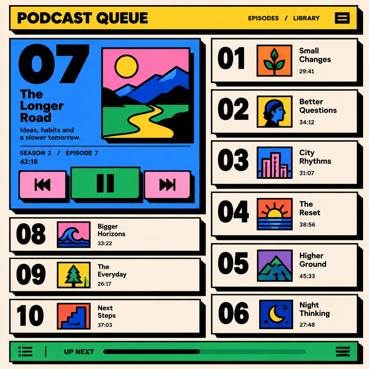
A neobrutalist audio-library screen recast as an editorial dashboard with one dominant queue card, dense metadata stacking, and stark geometric controls.
Make
Neobrutalist podcast queue dashboard: bold black outlines, flat saturated panels, hard offset shadows, oversized episode numbers, rectangular metadata cards, and chunky transport controls; dense two-column editorial grid, one oversized active card breaking the layout, minimal text, no logos.
This keeps the parent’s blunt outlines, saturated blocks, and shadowed cards, but changes the spatial idea from a centered player to a dense editorial queue. The visible difference is a broken two-column hierarchy, oversized episode numerals, and one dominant active card that interrupts the grid instead of simply restyling it.
A starting point: add your own subject or details in your image tool.
Another original example of the same style seed.
Automated review only; results vary by image tool.
Compare more directions
Explore other approaches for this kind of project.
Look closer: traits and nearby styles →
About this example
This image may have used extra directions. The seed above is a reusable starting point and may produce a different result.
- Created with
- OpenAI Image API
- Model
- gpt-image-2.5-flare
- Generated
- 2026-10-15
Original variation selected from research plan variation-neobrutalist-interface-exploration-1. Independent automated style and image review: The image keeps the Neobrutalist visual language from the parent seed: bold black outlines, flat saturated panels, hard offset shadows, oversized typography, rectangular cards, and chunky geometric transport controls. It is also a visibly different subject/composition from the existing music-player sample, shifting to a fictional podcast queue/library dashboard. The niche variation is clearly realized: a dense two-column editorial layout with a rigid episode grid, one oversized active card breaking the grid, stacked metadata, oversized numerals as navigation hierarchy, and a bottom up-next bar. The result is not a mere recolor or crop; the spatial structure and hierarchy are meaningfully different while remaining in the same style. Exact/perceptual checks passed. 1024px source enlarged to 1200px WebP; no human visual review.
How to use this promptRead as Markdown
Look closer at Neobrutalism
Heavy black outlines, flat saturated colors, oversized type, and hard offset shadows give an interface a bold graphic character.
In the original generated example: A music player with black-outlined pink and green buttons, hard shadows, a blue title card, and a red-and-blue portrait album cover. Notice which details catch your eye before deciding whether the whole style is for you.
Ask yourself: is it the palette, the surface, the shapes, or the subject you like? Save a favorite and use the visual taste guide to find a useful next direction.